BRANDING, IDENTITY, LOGO, & GRAPHICS.
 Rainbow Knitwear, a range of high-end intarsia knits, was launched in 2002 and needed a logo and brand identity to complement their range of products.
The premise of the colourful range was “Happy Knitwear” with influences including 1980’s Blue Peter, the 1970’s TV show called Rainbow, early Arcade games, and vintage knitwear as worn by Gyles Brandreth.
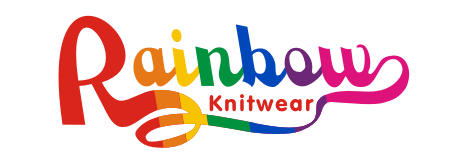 The colourful main logo, using all the colours of the primary rainbow, was developed with a scrolling capital “R” to invoke the yarn used to create the knitwear.
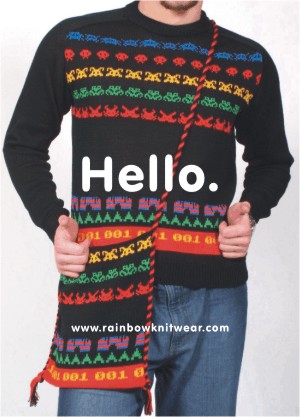 For printed materials such as business cards, catalogues, and swing-tickists, a simple rounded sans-serif font was used for body text with graphic blocks of colour, reminiscent of children’s “how to read” books.
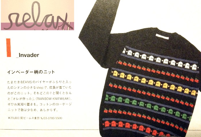 Handmade in Wales, Rainbow Knitwear was featured in The Telegraph, I.D. Magazine, The Observer, and The Face, to name a few publications, and received orders from Jones, Browns, Fletcher, Beams, Bond, Fred Segal, No-One, Zoltar, and many others, as well as developing a cult following in Japan.
Generated by Facebook Photo Fetcher 2
 286Blue produced the logo and branding as well as graphics for line-sheets and order forms.
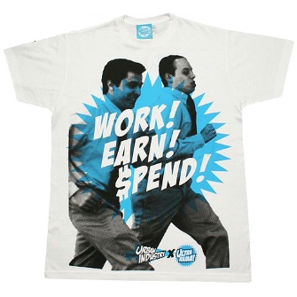

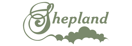
 Ahead of it’s time, Shepland launched in 2005 and pre-empted the premium menswear movement that gathered mainstream momentum in 2010. Harking back to a bygone age of authentic products and manufacturing heritage in Britain, Shepland featured a handcrafted range of premium knitwear, along with a collection of tees and sweatshirts.
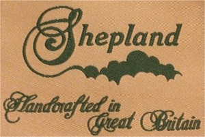 Shepland required a graphic identity that remembered the golden age of British manufacturing and conveyed a British sense of humour. The logo combined a vintage font to demonstrate the authenticity of the brand with a decorative flourish that could be interpreted as clouds or rolling hills.


 Rainbow Knitwear, a range of high-end intarsia knits, was launched in 2002 and needed a logo and brand identity to complement their range of products.
 The colourful main logo, using all the colours of the primary rainbow, was developed with a scrolling capital “R” to invoke the yarn used to create the knitwear.
 For printed materials such as business cards, catalogues, and swing-tickists, a simple rounded sans-serif font was used for body text with graphic blocks of colour, reminiscent of children’s “how to read” books.
 Handmade in Wales, Rainbow Knitwear was featured in The Telegraph, I.D. Magazine, The Observer, and The Face, to name a few publications, and received orders from Jones, Browns, Fletcher, Beams, Bond, Fred Segal, No-One, Zoltar, and many others, as well as developing a cult following in Japan.



 It would be remiss of us not to include our own graphics, branding & website. We wanted a clean & simple identity that was instantly recognisable through a strong use of one colour; namely, Pantone 286.
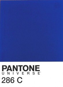 Pantone is the leading colour authority globally that print and fashion designers use when specifying particular colours. There are many variations of the colour blue for example, so the Pantone system enables designers to specify the exact shade of blue required, such as number 286.
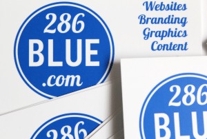 Naming our company after a Pantone colour number meant, of course, that we had to have our 286Blue business cards printed in the exact same shade.


