BRANDING, IDENTITY, LOGO, & GRAPHICS.
 Ahead of it’s time, Shepland launched in 2005 and pre-empted the premium menswear movement that gathered mainstream momentum in 2010. Harking back to a bygone age of authentic products and manufacturing heritage in Britain, Shepland featured a handcrafted range of premium knitwear, along with a collection of tees and sweatshirts.
The name of the brand was important as it had to refer to the wool knitwear whilst being punchy, short, and memorable. 286Blue named the brand Shepland, an amalgam of sheep and shetland, which sounded like a genuine area of the British isles and succinctly encapsulated the state of mind behind the brand.
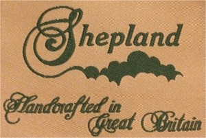
 Shepland required a graphic identity that remembered the golden age of British manufacturing and conveyed a British sense of humour. The logo combined a vintage font to demonstrate the authenticity of the brand with a decorative flourish that could be interpreted as clouds or rolling hills.
Vintage-effect graphics in tones of sage green and beige, similar to old vintage books, were used as a base for highly-scripted headlines and a faded italic body font.
The logo and branding was translated across printed materials, such as line-sheets and press releases, as well as on woven and printed labels.

Generated by Facebook Photo Fetcher 2


