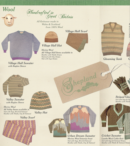
Ahead of it’s time, Shepland launched in 2005 and pre-empted the premium menswear movement that gathered mainstream momentum in 2010. Harking back to a bygone age of authentic products and manufacturing heritage in Britain, Shepland featured a handcrafted range of premium knitwear, along with a collection of tees and sweatshirts.
286Blue named the brand Shepland, an amalgam of sheep and shetland, which sounded like a genuine area of the British isles and succinctly encapsulated the state of mind behind the brand.
Shepland required a graphic identity that remembered the golden age of British manufacturing and conveyed a British sense of humour. The logo combined a vintage font to demonstrate the authenticity of the brand with a decorative flourish that could be interpreted as clouds or rolling hills.

