Margin London
BRANDING, IDENTITY, LOGO, & GRAPHICS.

Started back in 2002 as an affordable tradeshow for new & young designers, Margin wanted a to update their branding in 2006 from the previously neutral beige palette to something more colourful to accurately reflect the diversity of clothing & accessories brands the show presented to buyers and press.
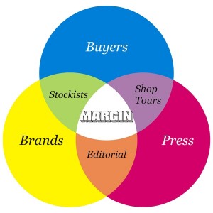
Margin London VennCMYK, the four key colours used when printing (Cyan Magenta, Yellow, and Black), were selected for their versatility and freshness along with the inspiration of pop-art, half-tone dots. Versatile and fresh when used online (the website & banner ads) and in print (invitations & magazine adverts), the branding has helped spread the word about the show and made it stand out on social media.

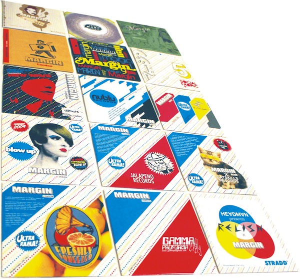
286Blue also designed the artwork for the promotional music CDs given to visitors of the exhibition. Artwork Record labels included Tru Thoughts, Catskills, Jalapeno Records, Ubiquity, and Nouvelle Vague.


Margin London


The original Margin logo, which was strong and instantly identifiable by previous visitors & exhibitors, was refreshed to reflect the brand update by replacing the solid drop-shadow shading with pop-art print-inspired dots, and a CMYK Venn diagram was appended to the logo. The Venn represents the cross-over opportunities the Margin tradeshow provides for buyers to interact with brands, brands with press, and press with buyers via the promotional shop tour videos.

Margin CDsThe clean palette of CMYK offered a striking and memorable identity that has proved to be enduring and timeless, as well as influential within the fashion industry (fashion trade magazine Drapers have adopted the CMYK palette for their 2012 redesign as well as using a CMYK Venn diagram, a mirror image of the one that 286Blue developed for the Margin logo, to punctuate the end of their feature articles).
WEBSITE.

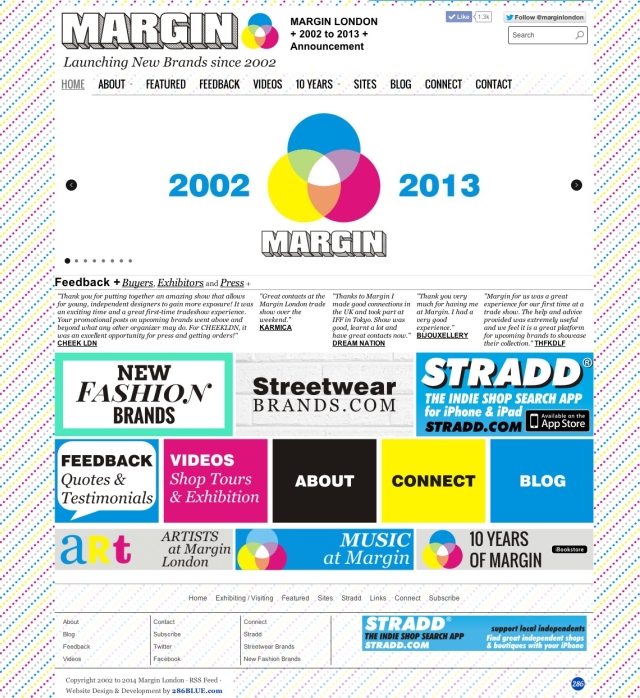
The CMYK colour palette proved striking and effective on the Margin website. The memorable colours came into their own against the 4-colour dotted background, the strong headline font of Arial, and the stylish use of Georgia, normal & italics, as body text.

The layout of the website was redefined to make it intuitive to navigate, and update, so visitors could find the information they required as quick as possible, as well as get in touch easily with the show for information about exhibiting or visiting. Facebook “Like” and Twitter “Follow” buttons were added on every page to gather followers & fans, as well as “Share” buttons which have been well-used to spread the word about various pages or blog articles on Facebook, Twitter, or via email.

Pages were optimised to rank higher on search engines which resulted in an increase of enquiries and mailing list subscriptions after the striking redesign.

www.margin.tv

Margin Website
CONTENT.
Copywriting:

286Blue helped Margin to set the relevant tone for all marketing materials, writing copy for all communications such as invitations and the exhibitor preview email newsletters. Professional yet sometimes irreverent to reflect the off-schedule nature of the event, the exhibitor preview email newsletters became eagerly anticipated by buyers and press as an indication of what to look forward to at the exhibition.

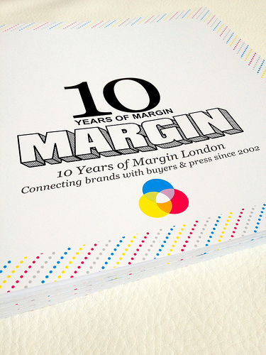
A major project that 286Blue wrote the copy for, as well as laying out the graphics for print, was the 10 Years of Margin London Book, a free publication distributed to press & buyers at the 10 Year edition of Margin in February 2012 as well as available for iPad from the Apple Bookstore. 286Blue designed and laid out the book, drawing on 10 years worth of information and photographs, as well as writing the content to convey the influence and effect the off-schedule trade event has had on the fashion industry.

Margin London 10 Year Book
Video:

Rather than producing a multitude of tradeshow videos, which are ultimately no more informative or engaging than a moving photograph with some backing music, Margin needed a more innovative way to feature video and interact with it’s audience of brands, buyers, and press.

As well as providing an affordable platform for independent new & young designers, the idea to help promote the core constituency of independent stores that regularly visit Margin was important.

Shop Tour Videos provided a window into diverse retail universes, from directional streetwear stores to elegant boutiques, and generated excitement amongst brands who could now see where their products were stocked (or where they wished them to be stocked) as well as helping to promote the boutiques themselves to consumers, via the Margin website, Facebook, YouTube, and Vimeo.

Savvy buyers from featured stores embedded the video on their website to give customers a taste of what their store has to offer. The Shop Tour videos were also featured on numerous blogs and websites, including Drapers, and shared heavily on Facebook & Twitter.

This website needs cookies to work correctly. Click the ACCEPT button to use cookies or click Read More for additional info.