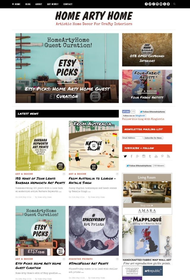
286Blue named the brand (a self-explanatory play on “Home Sweet Home” with an arty emphasis) and created the brand identity and website.
The logo and website design was created to reflect most of the illustrated work that was to be featured, through the use of vintage-style sign-writer and hand-drawn fonts.
A simple palette of black and white with punches of red (like the red dot on a sold artwork in a gallery) was used to produce an instantly identifiable brand that translates easily from the website to social networks.
The website is responsive, which means the layout adjusts to the size of the device the blog is viewed on, to look good on all screens, from smartphones and tablets to desktops and laptops.


