BRANDING, IDENTITY, LOGO, & GRAPHICS.
 It would be remiss of us not to include our own graphics, branding & website. We wanted a clean & simple identity that was instantly recognisable through a strong use of one colour; namely, Pantone 286.
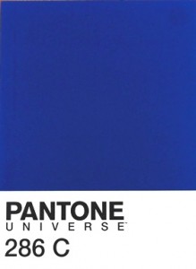 Pantone is the leading colour authority globally that print and fashion designers use when specifying particular colours. There are many variations of the colour blue for example, so the Pantone system enables designers to specify the exact shade of blue required, such as number 286.
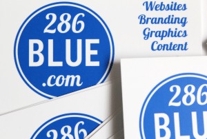 Naming our company after a Pantone colour number meant, of course, that we had to have our 286Blue business cards printed in the exact same shade.
We simply love the colour. It reminds us of elegant French street signs, Yves Klein’s saturated artworks, vibrant brushstrokes, Greek-island rooftops and wooden doors, Yves Saint Laurent’s Moroccan gardens, the Mediterranean Sea, sunloungers, Portuguese tiles, and the colour of beachfront railings and lampposts in Eastbourne, East Sussex, our home town.
Generated by Facebook Photo Fetcher 2
WEBSITE.
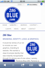
The website has been kept clean & simple to allow the work we’ve created for clients to shine through, with an elegant use of Art Deco, graphic, and artistic fonts against a backdrop of clean white and deep blue brushstrokes. With the use of mobile stylesheets, the website displays differently on mobile devices such as the iPhone, to enable better navigation and see the work more clearly without having to zoom in and out.
